Sunday 30 March 2014

Evaluation

This is my evaluation of my final piece,  i am happy with my final piece as it has lots of different techniques. I used a lot of different techniques as i enjoyed doing all the different parts to my final piece.

What techniques did you use to make your final piece?

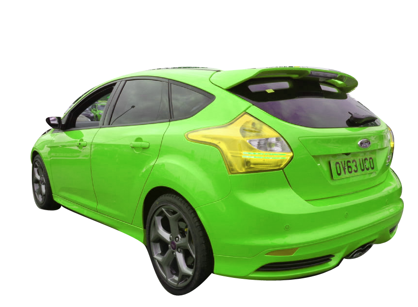
I used a lot of techniques as i wanted to get a mix of lots of techniques for my game case. I used pencil drawings for the main part of my front cover. I drew the car for the main part of my game case, i used a pen to go around the lines of the car to make sure the lines would show on the scanner. I used photoshop to add colour to my car and add tonal work to the car. It also let me add a lot of detail to the car. I also drew the city in the back ground, this was really good as it let me add all the windows. I then scanned it into the computer and added all the different shades to the skyscrapers, this looked really good as it had lots of different looks.

Why did i choose the mood of the front cover and how?

I wanted my game to look dark as it gave the front cover a bit of tense, it also made the car stand out from the rest of the game case. I also like how the windows in the skyscrapers are light so that the city then looks inhabited, this shows that the race is live. To create the background i needed to use a lot of different techniques.

I needed a stormy night picture from the internet, i then added affects to the night sky to make the sky look dark and tense. I wanted this because it attracts the audience to game, this is really important for the success of the product. I then used the tool to pull the light to dark this, let me pull the light from the moon to fade of the buildings. I used a whole moon to add more tense and to also make the game look more moody but with a bit of hope. I added grass to the sides of the road and i then a dark effect to make the game look more realistic and add tonal effect.

Why have i chosen this text?

I have chosen this font as it has impact for the front of the case, it really works it complements the moon. The font is really simple but looks really effective and it stands out. I have put i line around the font to make it stand out more from the  front cover.

I have also have gone for a simple font for my slogan, i have chosen a red for the font colour as i wanted it to be similar to the cars on the game box. It is a simple text so it stands out and it is bold. I really like this font as it also looks like the font you find near a race track.

I have also gone for simple font for the text that describes the game box, it is easy to read so it means the audience can see what the is about easily. I have gone for white text as it stands out from the background. I have also chosen the text as it then looks more formal for the game case.

Why have i chosen the look of the back of the case?

I have chosen a simple back to my game box, i have put all my images in line as i wanted a strict grid. This makes my game case feel like it is on the race grid ready to race it also makes my game case look more formal and professional. I have put my slogan at the top of my case so it will attract the audience and it also look really affective. I have put all the text about the game at the bottom so it looks really good and i have put the first sentence in caps lock so it stands out and sounds powerful.

What do i like about this design?

I really like the look of the game case as it has a dark mood on it but it also has two main colours to the game case, red and white they both are powerful colours. I really like the back case as it looks really effective and it is in our face. I am really happy how the game case for "real racing" has turned out, with all the different techniques.

What could i improve on for this game case?

To improve this design, i would improve the car at the front of my case as it would then appeal to the professional gamer, it would also attract a wider vary of people. But over all i am happy with this design.


Thursday 15 November 2012

Semi final front cover using my own car

The screen shot above shows the back ground that i will be using for my semi final, to create this image i  chose a city picture with a road leading up to it.  I then chose the sky and i also turned up the brightness of the city and the sky. I also blurred the tips of the skyscrapers into the sky to make the sky look brighter. I also messed around with other things and this is what i came up with. 


This is a picture that i took at Shrewsbury, i really like the look of this car. I liked the angle of the photo that i took and this car would look good on the front of a game case. 
This is the car that i took at Shrewsbury, to get the car to look like this i have done a lot. I have used the pen tool to draw around the car, when i had drawn all the way around the car. I clicked inverse with means i can then delete the background of the car. I then changed the colour of the car with makes the car look even more race like. I also like it as it has changed the colour of the widows as it has changed it to oil look. I really like this look as it makes the car look tuned and modified.
The screen shot above shows the text that i have chosen for this game case, i got this text from dafont website. This text looks really good as it looks really informal and race like.
This is what i have created after i have put all of the little things together, and i have created the game case for real racing. This game case looks really professional and it has used a lot of different Techniques. 

Wednesday 14 November 2012

Technique 3 - Painting technique

This is a book that i used for inspiration and to help me draw the cars for this technique. The book is called Really cool stuff, the author for this book is called Dougdubosque. This book has lots of different sections that a can refer to, the section i used was car section.  

This is the page i used to help me draw a car, the i have chosen to draw is a "1946 Chrysler town and country".I choose this car as it gives me a bit of a challenge to copy and paint.  I really like the look of this car as it is a old classic, i also think it would look good on a game case. 

This is my final piece for this technique, to create this piece i needed to draw the car out first. After i had drawn the car out accurately, i painted the parts of the car that needed to have colour, i used acrylic paints to paint the car. I am really happy with the final piece, i like the colour i have chosen for the car.  
This is the page i used to help me draw a car, the i have chosen to draw is a "1967 Cadillac".I choose this car as it gives me a bit of a challenge to copy and paint.  I really like the look of this car as it is a old classic, it would look really good after a bit of Photoshop work done to it. 

This is my final piece for this technique, to create this piece i needed to draw the car out first. After i had drawn the car out accurately, i painted the parts of the car that needed to have colour, i used acrylic paints to paint the car. I like the look of this car and it would look excellent on a game case.


This is the page i used to help me draw a car, the i have chosen to draw is a "1934 ford model A".I choose this car as it gives me a bit of a challenge to copy and paint.  I really like the look of this car as it is a old classic, it would look really good on the front of a game case as it looks like a artist copy
This is my final piece for this technique, to create this piece i needed to draw the car out first. After i had drawn the car out accurately, i painted the parts of the car that needed to have colour, i used acrylic paints to paint the car. I like the look of this car and it would look excellent on a game case. This car is my favorite out of all of my paintings aas it has just turned out brilliant.


Tuesday 13 November 2012

Technique 2 - Pencil Drawings

This is a book that i used for inspiration and to help me draw the cars for this technique. The book is called Really cool stuff, the author for this book is called Dougdubosque. This book has lots of different sections that a can refer to, the section i used was car section.  

This is a page that i used in " how to draw really cool stuff", there are four different steps for drawing this car. The car i have chosen to draw is a Dodge Viper, i really like this car as it goes with the theme of my game. This car was really simple to draw but it looks really good when it is finished. 

This is a page that i used in " how to draw really cool stuff", there are four different steps for drawing this car. The car i have chosen to draw is a Corvette, i really like this car as it goes with the theme of my game. This car was really simple to draw but it looks really good when it is finished. 
This is a page that i used in " how to draw really cool stuff", there are four different steps for drawing this car. The car i have chosen to draw is a Audi Avus, i really like this car as it goes with the theme of my game. This car was really simple to draw but it looks really good when it is finished. 
This is what the final car should look like after i have finished all the details of the car, i really like the look of this car. This is one of my favorite techniques that i have used. 


This is what the final car should look like after i have finished all the details of the car, i really like the look of this car. This is one of my favorite techniques that i have used. 


This is what the final car should look like after i have finished all the details of the car, i really like the look of this car. This is one of my favorite techniques that i have used. 
This is what the final car should look like after i have finished all the details of the car, i really like the look of this car but its not very fast looking. This is one of my favorite techniques that i have used. 


This is what the final car should look like after i have finished all the details of the car, i really like the look of this car. This is one of my favorite techniques that i have used. 

This is what the final car should look like after i have finished all the details of the car, i really like the look of this car. This is one of my favorite techniques that i have used. 
This is what i have came up with when i added all the details to the cars and added tonal affects, this has turned out to be really good looking. I have found this technique easy to do but very effective. 

Photoshop - Changing a city picture


The screen shot above show that i am using photo shop, to create this background i used a city picture and i a storm picture. I used the pen tool to go round all the towers and then i put the storm in the back ground. This is a dramatic background to a game.

Here i have simply changed the background to black and white to make the game look effective and powerfull.

Monday 12 November 2012

Photoshop - Colours on car changing using Photoshop

The screen shot above shows that the program i am using in this technique is Photoshop, i am coped one of my photos that i took and put it in the program. To delete the background of the car, i used the pen tool. This lets me create a smooth line around the car, this technique s really simple to use. You use the pen tool by clicking on the lines of the car and moving the mouse to make the lines shallow or  a deep curve. Then you press Alt and that lets you shorten the arms off the point, which then makes it easier to do the next point. After i have gone around all the car and i have a solid black line around the car, i then go to paths and select the third one at the bottom. This makes the car have spotty line around the car, i then go and click inverse which is at the top of the program. This means that i can then press backspace and it will delete the background from the car. 

The screen shot above is example of what can happen when you change the colours of the car. I have done his by simply by selecting the car and clicking the colours option. I then clicked the lime green colour and turned up the saturation of the colour. This then gave me a car that then looks like this, this technique is really simple to do but very effective. 
The screen shot above shows that i have put the car back to the naormal colour and i have then made the car look more cartoon like. This is quite simple to do as all you really need to do is adjust the saturation of the colour and the brightness.  I really like this technique as it looks really professional and it also stands out. 


In this screen shot you can see that i have changed the colour of the car to make it stand out a lot more then the colour of the orange. i have also turned up the brightness of the car so it really stands out it also highlights all the light and dark points of he car. This is one of my favorite techniques i have used on Photoshop. 

In this final Screen shot of this technique i have Changed the car to a light blue colour which makes it stand out and look different to the rest of the cars. To do this technique i have turned the brightness up so the cars roof fades into the background. This car would look really good on the front of a games case as it looks really cool and sporty.